
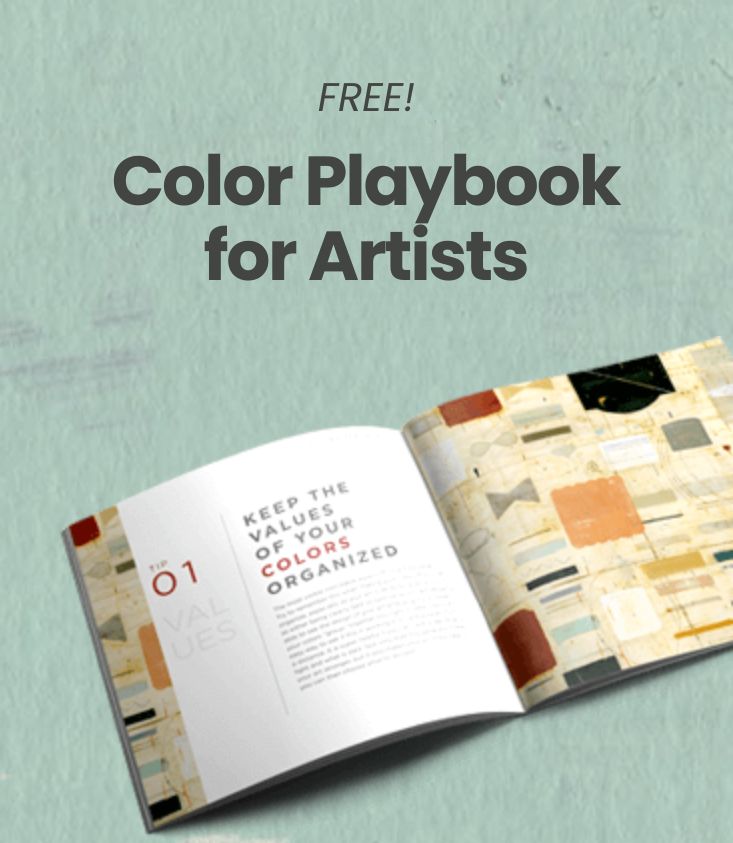
Organizing your art using values so that the viewer sees first, what you want them to.
4 Comments

Hi! I’m
Nicholas Wilton
the founder of Art2Life.
With over 20 years experience as a working artist and educator, I’ve developed a systematic approach that brings authenticity, spontaneity and joy back into the creative process.
Join me and artists from all over the world on our Art2Life Instagram account or learn more here about Art2Life.

I agree Nicholas. While I’m working, I am constantly taking pictures of my work w/ a small point and shoot camera, set in black and white mode, so that I can see the values of the color I’m putting down. Because of this constant analysis in black and white, I’ve become much better at seeing the value of color. Now I go to the camera only to check to make sure the value I’m seeing with my eye, is corresponding to the actual value as registered in the camera. Thank you!
ahhhh haaaa! Makes sense!
Great! It’s making more sense now. I would say that correlates to the values in say a landscape…in the shadows you have maybe three values that need to be all darker than any of the values in the sun lit areas. If you don’t get that right, the scene won’t read right, or at the very least, you need to know what you are doing with values so you can control what you want to communicate.
Yeah right….yep