
As you might have noticed, a lot of my work revolves around the concept of difference – a dark shape next to a light shape, a subtle mark next to a bold mark, and so on. Sometimes, however, these elements are too separate from one another, and as a whole the piece lacks a sense of cohesion.
Watch the video to see the little trick I use to bring everything together.
How do you unite the composition of your work? I would love to hear your approach!
Please feel free to share this with your friends, and anyone else who you think might be interested.
In gratitude, Nicholas
27 Comments
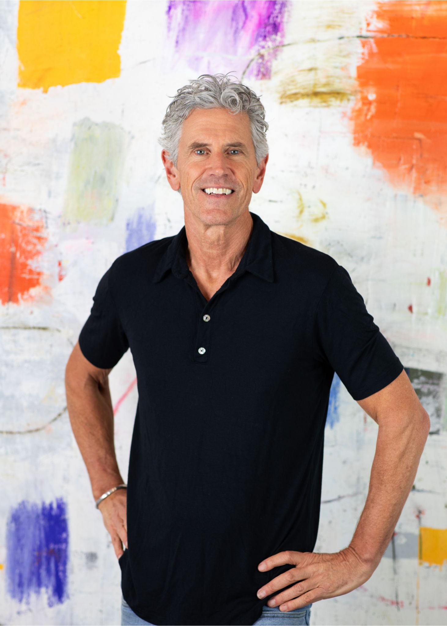
Hi! I’m
Nicholas Wilton
the founder of Art2Life.
With over 20 years experience as a working artist and educator, I’ve developed a systematic approach that brings authenticity, spontaneity and joy back into the creative process.
Join me and artists from all over the world on our Art2Life Instagram account or learn more here about Art2Life.

I always look forward to Sunday when your inspirational video tutorial comes in. Many thanks!
I love the interconnectedness using lines and gouges. I have used this in my work in various fashions. I find that it adds another layer of visual and tactile texture and helps lead the eye around the work.
I like your long light weight T square… I’m using a metal one and it’s so heavy. Tool tips, process tips always useful. Thanks! Coffee and Sunday video great start to my day… but surely you made it yesterday… as it’s only 7:00 am when I watch!
I need to pull my current painting together… so I’m inspired.
Always enjoy your insights Nick! So great to have these little (and big) reminders in my inbox! Thanks!
GREAT!! THANKS NIC!
Love watching you work- thank you, Nicholas- you’re so great to share your thought and work processes with us!
Thank you for the insight into your work.
Well, that is so interesting. That’s what we do in life isn’t it? Make connections with some people, some things…and by pass other opportunities. Choices,decisions. Sometimes we miss the sublime, sometimes we connect and, oh boy, that’s terrific. Sometimes we choose to be alone and in solitude and that’s terrific. I just got that connection to art in watching this. This idea connects with the unconscious…with our own decision making process. Sooooo kewl.
I think about connecting all the time in my process but I don’t use straight lines. I use curves or just marks. My work is less linear and more organic.
With the lines, it’s as though you’ve added a tour guide for the eyes. Instead of hopping around randomly from one town to the next, there is now an implied order to the journey. I’ve discovered that if my shapes are all angular, adding curved lines such as half-circles, is a nice change from all the sharp corners, like finding yourself on a curved path in an otherwise gridded neighborhood. Thanks again for your insights, always food for thought.
Thank you for this insight, Nicholas. As usual, it’s very helpful.
Nicholas, you are the gift that keeps on giving!! I love all your Sunday videos. Today’s came at a particularly good time for me as I needed just that little push to get me into the studio again after some frustrating sessions.
Wow! Yes I do apply line to weave things together into a whole statement and to connect the elements👍
Thank you for bringing this intent to light Nicholas.
Thank you Nick. Your videos are one of the things I look forward to my Sunday mornings!
Good thoughts as always, Nick. Thank you.
aha! Simple yet also profound. Thanks for articulating this so well!
I like to use charcoal pencils to do mark making on my paintings, too. It adds another layer and direction to the piece. I think it adds interest. One I’m working on right now, though, seems to be a canvas that has some bad energy. Every time I make my marks, let them sit for a day or so, and come back to use a fixative so I can add more paint and/or varnish to it, the marks just muddy up. I’ve tried 2 different types of fixative with the same nasty results. It’s always worked in the past for me. Not sure if the canvas is just being rebellious in some way?!? Just odd that after doing this for a few years, all of a sudden I get one that doesn’t want to take the charcoal.
Once again, thanks for inspiration!
Hi Nicholas, Thank you for your videos—they are always interesting and informative. One request: would you please do a short video showing your work space—especially the wall where you paint, and the kind of lighting that produces that lovely evenness of light we see on you and paintings in the videos?
That T-square is a great idea for a tool, and it was so interesting to see how connecting some of the shapes really did alter the feeling of your piece. Super idea and suggestion, and I like that the process was random and somewhat deliberate at the same time. It’s fun to see where our hand and mindset can take us. Thanks, Nick, as always for your inspiring and energizing little gems!
“The greatest and the smallest, light and dark,
right and wrong – they all come together to form the miracle that is
life, and none can exist without the others.” Anon
Thank you for bringing to life the above quote!
You have awakened an new creative door for me.
I can’t wait to experiment.
As always…thank you ~
The work I’m doing right now is kind of flowy and curvy. I have trouble figuring out if straight lines like this will work connecting those kinds of shapes. It seems to work well with more geometric shapes, but the concept is intriguing.
Never thought of that contrast. Thanks Nick!
I love watching your videos, they are so inspired with meaning and why art matters.
Contrast is just about the first thing our eyes will notice. Especially light and dark. Seeing the example of contrast right in front of us is very helpful. Thanks so very much!
Love watching you paint and talk. Looks a bit like archaeology with the word fragment scribble and mysterious lines across space. Gorgeous colours this week, yourself included. Thanks for the tone poem and thoughts on separation and connection.
Love the large T Square and plan to create my own. Your idea of connecting with charcoal is great since it can be smudged or ehanced with paint to make it bolder and/or more permanent, or it can be wiped off leaving only a hint of line.
I am becoming more aware of contrast but until now have only thought of it as dark and light. Thanks for the thoughts and great demo.